Recently, I worked on a project involving drayage rates data from drayage.com website. The site lists quotes for moving shipping containers, meaning how much it costs to haul a container from one terminal to another. The project itself had a different focus, but I found the dataset surprisingly interesting. So I thought, why not take a detour and explore it from a data science perspective? Specifically:
Given the distance between two locations, can we model the expected range of drayage rates?
In other words, if we know a distance d between an origin and a destination terminal, can we estimate the distribution of rates P(r|d)?
The Dataset
The dataset I used was scraped directly from drayage.com. Since there’s no official API, I wrote a small script to extract the data. The site covers drayage rates across all U.S. states, but for this analysis, I decided to focus on New Jersey (NJ).
There’s no special reason behind choosing NJ. Its dataset was simply large enough and diverse enough to make the analysis meaningful (and to avoid spending the rest of my life scraping).
Getting the Data
The website allows data retrieval through a URL with the following format: https://www.drayage.com/directory/dray-rates.cfm?state=NJ&city=Newark&dateRange=12
From the URL, we can see that it accepts three parameters:
- state
- city
- dateRange
For this analysis, state is fixed to NJ, and I collected rates for all cities in that state.
The dateRange parameter is set to 12, meaning I pulled data from the past year.
The script below performs the scraping process from the drayage.com website, followed by cleaning, standardizing, and transforming the results into a pandas DataFrame. It starts by sending requests to the website for each combination of state and city. Next, the BeautifulSoup library is used to parse the HTML content and extract the relevant information. Finally, the data is cleaned, data types are standardized (for example, converting numeric fields into integers or floats), and the results are combined into a single DataFrame.
def clean_text(text):
    # remove suffix () and miles
    if text.endswith("()"):
        text = text[:-2]
    text = text.replace("miles", "")
    text = text.strip()
    return text


def parse_rate(text):
    text = text.lower()

    # include only USD data
    if (text.endswith("cad")) or ("$" not in text):
        return

    # remove non-numeric characters
    text = text.replace("usd", "")
    text = text.replace("=", "")
    text = text.replace("$", "")
    text = text.replace(",", "")
    text = text.strip()
    return text


def parse_rate_int(text):
    text = parse_rate(text)
    return int(text)


def parse_rate_float(text):
    text = parse_rate(text)
    return float(text)


def parse_date(text):
    text = text.strip().lower()
    return dt.datetime.strptime(text, "%Y-%b-%d").date()


def parse_miles(text):
    text = clean_text(text)
    return int(text)


def scrape_data(state):
    if os.path.exists(f"{state.lower()}.csv"):
        print("Loading from local file...")
        df = pd.read_csv(f"{state.lower()}.csv")
    else:
        print("Scraping website...")
        browser = mechanicalsoup.Browser()
        cities = state_city_df.query(f"State == '{state}'").City.unique()

        df_data = []
        for city in cities:
            print(f"Getting data from {city}, {state}")
            url = f"https://www.drayage.com/directory/dray-rates.cfm?dateRange=12&state={state}&city={city}"
            response = browser.get(url)
            rows = response.soup.select("body > table")[0].select("table")[0].select("tr")
            for i, row in enumerate(rows):

                # ignore the first 3 rows as they are table headers
                if i < 3:
                    continue

                cols = row.select("td")

                # skip if the table body contains no data
                if len(cols) < 14:
                    print(f"No data from {city}, {state}")
                    break

                try:
                    row_data = {
                        "state": state,
                        "city": city,
                        "gate": cols[0].get_text(strip=True),
                        "metro": clean_text(cols[1].get_text(strip=True)),
                        "total_rate": parse_rate_int(cols[8].get_text(strip=True)),
                        "description": repr(cols[9].get_text(strip=True)),
                        "miles": parse_miles(cols[10].get_text(strip=True)),
                        "rate_per_mile": parse_rate_float(cols[11].get_text(strip=True)),
                        "date": parse_date(cols[12].get_text(strip=True))
                    }

                    if row_data["total_rate"] is None:
                        print(f"Invalid total_rate {cols[8].get_text(strip=True)}")
                        continue

                    df_data.append(row_data)
                except ValueError as e:
                    print(f"Invalid data {e}")
                    continue

        df = (
            pd.DataFrame.from_records(df_data)

            # set data type
            .astype({
                "total_rate": int,
                "description": "string",
                "miles": int,
                "rate_per_mile": float,
            })

            # standardize missing values
            .replace(
                {
                    "state": {"": pd.NA},
                    "city": {"": pd.NA},
                    "gate": {"": pd.NA},
                    "metro": {"": pd.NA},
                    "description": {"": pd.NA},
                }
            )

            # drop missing values
            .dropna()

            # remove duplicate entries
            .drop_duplicates()
        )
        df.to_csv(f"{state.lower()}.csv", index=False)

    return (
        df
        .drop(["description"], axis="columns")

        # set categorical columns
        .astype({
            "state": "category",
            "city": "category",
            "gate": "category",
            "metro": "category",
        })

        # include only valid data
        .query("miles > 0")
    )


df = scrape_data("NJ")
The script handles two main scenarios:
- If a saved dataset already exists in the local directory, it will load that file directly.
- If no saved file is found, it will scrape the data from the website instead.
After retrieving the data, a few post-processing steps are applied:
- Clean the values, for example by removing the suffix “ miles” from the miles column.
- Standardize data types, such as converting miles column to integer.
- Remove missing values to ensure data consistency.
- Select only the relevant columns needed for the analysis.
- Filter valid observations to include only those where miles > 0.
Understanding the Data
Before diving into modeling, let’s first understand what the data represents.
In general, datasets can be categorized into two types based on how the data is collected: observational and experimental. In an experimental dataset, the data is collected under controlled conditions, where researchers can assign treatments to observe their effects. In contrast, an observational dataset is collected passively, meaning we do not control how the data is generated. Since the data in this project comes from an existing source that we have no control over, we’ll treat it as observational data.
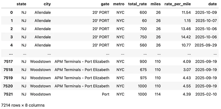
The cleaned dataset contains over 7,000 rows and 7 columns. Each row represents a single rate quote, while each column describes a variable. A sample observation might look like this:
A container movement from “20'PORT NYC" to Allendale, NJ, with a total distance of 26 miles and a cost of $600.
Here’s what each column represents:
- state: Categorical variable indicating the U.S. state (all are “NJ”).
- city: Categorical variable indicating the destination city.
- gate: Categorical variable indicating the origin terminal or gate.
- metro: Categorical variable describing the metro area or region.
- total_rate: Numeric variable (integer) representing the total drayage rate in dollars to move a container from a specific gate to the destination city. Since detailed destination coordinates are not available, there can be multiple records with the same city pair but different distances.
- miles: Numeric variable (integer) representing the total distance between origin and destination.
- rate_per_mile: Numeric variable (float) representing the rate per mile, calculated from total rate divided by distance.
- date: Date variable indicating when the rate was recorded.
Now that we understand the structure and type of data we are working with, let’s look at the fun part: exploring how distance and rate relate.
How does distance relate to total rate?
To get a sense of the data, let’s look at the scatterplot between miles and total_rate in the data.
plt.scatter(df.miles, df.total_rate, alpha=0.4, color="#003f5c", label="Data")
plt.xlabel("Distance in Miles")
plt.ylabel("Drayage Rate in USD")
plt.show()
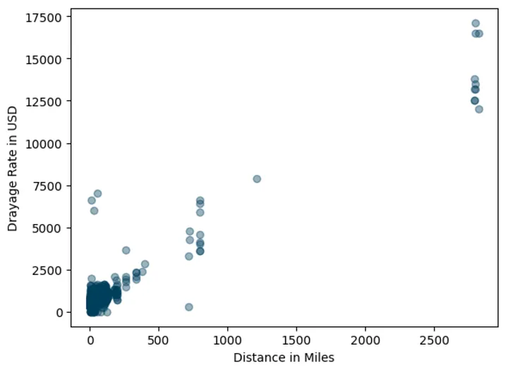
There’s not surprising about the data.
The plot showing that there is positive association between miles and total_rate.
The longer the trip (higher miles), the higher the rates.
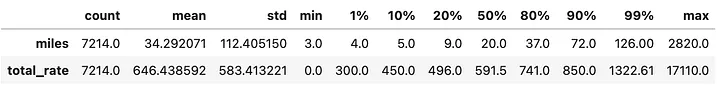
However, we can also spot some outliers, rates that seem oddly high for certain distances. In addition, the table below shows that observations come from trips under 200 miles.
At this point I made a pragmatic decision to include only data where less than or equal to 300 miles. Not for any fancy statistical reason, just for my sanity.
# include only less than or equal to 300 miles
df = df.query("miles <= 300")

# use LOWESS smothing line to visualize trend
lowess_x, lowess_y = lowess(df.total_rate, df.miles, frac=0.2, return_sorted=True).T

plt.scatter(df.miles, df.total_rate, alpha=0.4, color="#003f5c", label="Data")
plt.plot(lowess_x, lowess_y, color="#ff6361", label="LOWESS")
plt.xlabel("Distance in Miles")
plt.ylabel("Drayage Rate in USD")
plt.legend()
plt.show()
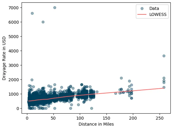
Added lowes smoothing so that we can better see the positive association between miles and the total_rate.
The smoothed line confirms the upward trend.
Interestingly, the rate distribution appears right-skewed.
Some trips are much more expensive, likely due to extra charges like chassis fees or special handling.
Let’s zoom in on shorter trips (< 100 miles):
plt.hist(df.query("miles < 100").total_rate, 70, color="#003f5c")
plt.xlim(0, 3000)
plt.xlabel("Drayage Rate in USD")
plt.show()
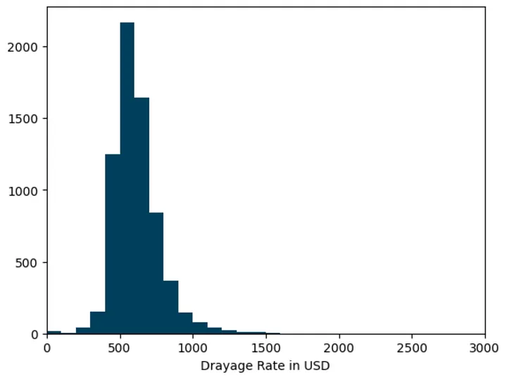
It’s clearly that the distribution is right-skewed, which means our modeling approach needs to handle that asymmetry especially if we care about predicting not just the average but also the variability in rates.
Note that this histogram approach might not be accurate since we implicitly assume that the rate distribution don’t change over time.
Estimating the Average Rate
Let’s start with a simple question:
What’s the typical drayage rate for a given distance?
To answer this, I used a straightforward Ordinary Least Squares (OLS) regression. No need for fancy deep learning model or even tree-based model, right?
# define dataset to fit
X_train = sm.add_constant(df.miles.values.reshape(-1, 1))
y_train = df.total_rate.values

# fit OLS model
ols_model = sm.OLS(y_train, X_train)
ols_fit = ols_model.fit()
print(ols_fit.summary())
OLS Regression Results
==============================================================================
Dep. Variable:                      y   R-squared:                       0.310
Model:                            OLS   Adj. R-squared:                  0.310
Method:                 Least Squares   F-statistic:                     3234.
Date:                Wed, 29 Oct 2025   Prob (F-statistic):               0.00
Time:                        10:22:40   Log-Likelihood:                -47664.
No. Observations:                7185   AIC:                         9.533e+04
Df Residuals:                    7183   BIC:                         9.535e+04
Df Model:                           1
Covariance Type:            nonrobust
==============================================================================
                 coef    std err          t      P>|t|      [0.025      0.975]
------------------------------------------------------------------------------
const        495.7798      3.070    161.485      0.000     489.761     501.798
x1             4.2893      0.075     56.871      0.000       4.141       4.437
==============================================================================
Omnibus:                    13839.271   Durbin-Watson:                   1.903
Prob(Omnibus):                  0.000   Jarque-Bera (JB):         62751086.680
Skew:                          14.645   Prob(JB):                         0.00
Kurtosis:                     459.891   Cond. No.                         57.6
==============================================================================
Looking at the result above, those residuals are quite high and they are obviously non-normal. That violates OLS assumption. In the simplest form, we can say that the model able to fit the mean trend but the residuals are highly skewed and contain outliers. Now let’s plot the prediction result.
# construct unseen data
X_test = np.sort(rng.uniform(1, 301, size=100)).astype(np.int32).reshape(-1, 1)
X_test = sm.add_constant(X_test)
y_pred = ols_fit.predict(X_test)


plt.scatter(df.miles, df.total_rate, alpha=0.4, color="#003f5c", label="Data")
plt.plot(X_test[:, 1], y_pred, color="#ff6361", label="OLS Prediction")
plt.xlabel("Distance in Miles")
plt.ylabel("Drayage Rate in USD")
plt.legend()
plt.show()
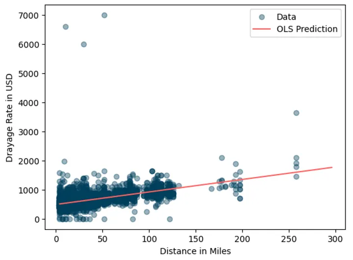
This model gives us a simple way to estimate average drayage rates for any distance.
What's the application for this estimation?
This model is useful for business owners to predict “market average” and use the estimation to compare with their quotes and determine next action (e.g. adjust the quote).
For example, suppose my quote for a 50-mile trip is $750. If the model predicts a market average of $710, my quote is 5% higher. If it were 15% lower, I could consider it “competitively priced”.
def compare_rate(model, distance, my_quote):
    x = np.array([[1, distance]]).astype(np.int32)
    market_prediction = model.predict(x)[0]
    is_lower_15 = "YES" if my_quote < (market_prediction * 0.85) else "NO"

    print(f"{'Trip Distance:':45} {distance:>8.1f} miles")
    print(f"{'My Quote:':45} {my_quote:>8.1f} USD")
    print(f"{'Prediction of market average:':45} {market_prediction:>8.1f} USD")
    print(f"{'Difference with (predicted) market:':45} {my_quote - market_prediction:>8.1f} USD")
    print(f"{'Is my quote 15% lower than (predicted) market:':45} {is_lower_15:>7}")


compare_rate(ols_fit, 50, 750)
Trip Distance:                                    50.0 miles
My Quote:                                        750.0 USD
Prediction of market average:                    710.2 USD
Difference with (predicted) market:               39.8 USD
Is my quote 15% lower than (predicted) market:      NO
Beyond the Average: Modeling Quantiles using Quantile Regression
While OLS model above help us estimate the “typical” rate, the business problems often requires managing uncertainties. That comes to another interesting use case, which to model beyond average but instead the range of expected rates.
For example, a 50-mile move might typically cost $700, but data shows that during high season it can rise to $1,000. By knowing this variability in the market data, business owner will have an opportunity to set more flexible pricing based on service offered or risk appetite. For example, business owner can quote $700 for regular customers and offer a premium quote of $1000 USD for time sensitive jobs.
Many techniques can help us to achieve that. In this case, I use Quantile Regression to model a set of quantiles of drayage rates given a distance. It is basically a type of regression model that instead of estimating the condition mean of the response variable across a set of predictor variables, it estimates the conditional quantiles (e.g. median) of the response variable.
# example fitting quantile regression model
qr_model = sm.QuantReg(y_train, X_train)
qr_fit = qr_model.fit()
print(qr_fit.summary())
QuantReg Regression Results
==============================================================================
Dep. Variable:                      y   Pseudo R-squared:               0.2523
Model:                       QuantReg   Bandwidth:                       27.63
Method:                 Least Squares   Sparsity:                        251.5
Date:                Wed, 29 Oct 2025   No. Observations:                 7185
Time:                        14:01:52   Df Residuals:                     7183
                                        Df Model:                            1
==============================================================================
                 coef    std err          t      P>|t|      [0.025      0.975]
------------------------------------------------------------------------------
const        475.2524      2.098    226.540      0.000     471.140     479.365
x1             4.2913      0.052     83.265      0.000       4.190       4.392
==============================================================================
Next, let's use QuantReg model to model other quantiles and plot the prediction results.
# quantiles to model
quantiles = [0.05, 0.25, 0.5, 0.75, 0.95]

# function to fit a quantile
def fit_model(q):
    res = qr_model.fit(q=q)
    return res

# fitting
qr_fits = {str(q): fit_model(q) for q in quantiles}
plt.scatter(df.miles, df.total_rate, alpha=0.4, color="#003f5c", label="Data")
colors = ["#488f31", "#afb059", "#fcd39d", "#ec8f65", "#de425b"]

# plot each quantile
for i, (q, qr_fit) in enumerate(qr_fits.items()):
    y_pred = qr_fit.predict(X_test)
    plt.plot(X_test[:, 1], y_pred, color=colors[i], ls="--", label=f"Prediction Q({q})")


plt.xlabel("Distance in Miles")
plt.ylabel("Drayage Rate in USD")
plt.legend()
plt.show()
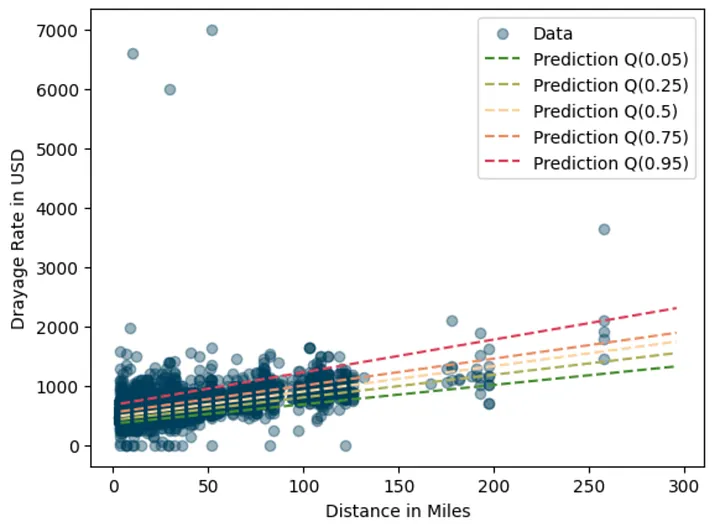
Very nice looking graph. Each quantile captures different parts of the rate range, giving a fuller picture than OLS alone.
Of course for more valid result we need more rigorous evaluation procedure using hold out set and evaluated against evaluation metrics. You get the idea.
Using Quantile Predictions for Business Decisions
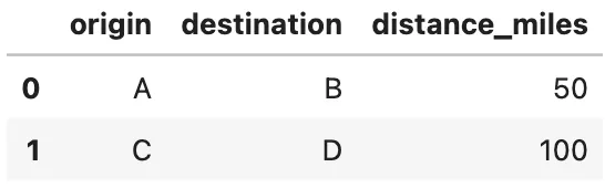
Now we can follow the same procedure for estimating quantiles. Let’s say we have two container movements: a 50-mile trip and a 100-mile trip.
movement_df = pd.DataFrame({
    "origin": ["A", "C"],
    "destination": ["B", "D"],
    "distance_miles": [50, 100]
})
Applying the models to predict quantiles for both cases.
def predict_quantiles(models, data):
    result = data.copy()
    X = sm.add_constant(data.distance_miles).values

    for q, model in models.items():
        y_pred = model.predict(X)
        result[f"prediction_Q({q})"] = y_pred
    return result


predict_quantiles(qr_fits, movement_df)

Now we can interpret the result like this:
- For the 50-mile trip, the median market rate is 689 USD, which represent typical customer is likely to pay.
- If we quote 700 USD, which is very close the median (slightly above it).
- It will be within inter quartile range between Q(0.25) and Q(0.75) so the quote is competitive and reasonable.
- A small reduction (2-3 %) might worth to test to improve competitiveness. For example if current demand is low.
While for the 100-mile trip,
- The median market rate is 904 USD
- The quote is 1000 USD (10% higher than the median) and sitting around Q(0.75) or the 75th percentile.
- This suggest the quote targets premium customer. The quote is considered higher but not extremely high as it’s still way below 95th percentile.
- A small adjustment to the quote might still be reasonable to test if the target is premium customer. Maybe slightly below Q(0.9) or around 1100 USD can still be in consideration.
Here’s another way to look at it. The red dots represent the current quotes, while the shaded blue area shows the typical market range. For the 100-mile trip, moving the dot slightly to the right would mean positioning the quote toward the premium end of the market.

Wrapping Up
So there we have it: a small, curiosity-driven exploration that turned intoa practical model. We started by exploring how distance relates to drayage rates, built a simple OLS model to estimate the average rates, and then extended it with Quantile Regression to capture its variability.
And maybe the best part?
We can now estimate drayage rates and explain why the quote is (or isn’t) competitive without whining about it too much.